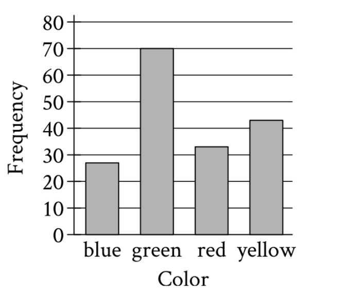
A data set consists of 173 colors. The bar graph shows the number of times each color appears in the...
GMAT Problem-Solving and Data Analysis : (PS_DA) Questions
A data set consists of 173 colors. The bar graph shows the number of times each color appears in the data set. Which color appears 70 times?
[Bar graph showing Frequency (y-axis, 0-80) vs Color (x-axis: blue, green, red, yellow). The bars show: blue ≈ 27, green = 70, red ≈ 33, yellow ≈ 43]
Blue
Green
Red
Yellow
1. TRANSLATE the question into what you need to find
What the question asks:
- 'Which color appears 70 times?'
What this means for the graph:
- Find which bar has a height of exactly 70 on the frequency axis
2. INFER the relationship between the graph and the question
The bar graph shows frequency (how many times each color appears) on the y-axis. So:
- The height of each bar = the number of times that color appears
- We need to find which bar reaches the 70 mark
3. TRANSLATE the visual information from each bar
Reading from left to right:
- Blue bar: Reaches about 27-28 on the frequency scale
- Green bar: Reaches exactly 70 on the frequency scale
- Red bar: Reaches about 33-34 on the frequency scale
- Yellow bar: Reaches about 43-44 on the frequency scale
4. Identify the answer
The green bar is the only one that reaches exactly 70 on the frequency axis, so green appears 70 times in the data set.
Answer: B. Green
Why Students Usually Falter on This Problem
Most Common Error Path:
Weak TRANSLATE skill - Mismatching bars to color labels:
Students sometimes misread which bar corresponds to which color, especially if they rush or don't carefully trace from the bar up to the frequency value and down to the color label. For example, a student might:
- Look at the yellow bar (which reaches about 43) and mistakenly think it reaches 70
- Confuse the ordering and read the wrong color label
This may lead them to select Choice D (Yellow) if they misread the yellow bar's height, or lead to confusion and guessing among the options.
Second Most Common Error:
Weak TRANSLATE skill - Imprecise height estimation:
Students might have difficulty precisely reading where the top of a bar aligns with the gridlines, especially if:
- They focus on bars that are 'close' to 70 (like the yellow bar at ~43)
- They estimate rather than carefully checking which bar exactly reaches the 70 line
- They confuse the green bar (70) with other bars
This causes them to get stuck between options and leads to guessing, or they might select Choice C (Red) or Choice D (Yellow) if they misestimate heights.
The Bottom Line:
This problem is straightforward if you carefully TRANSLATE the visual information, but it requires precise reading of the graph. The key is to systematically check each bar's height against the 70 mark on the frequency axis rather than quickly glancing and estimating. Students who rush or don't trace carefully from bar to label often make matching errors.
Blue
Green
Red
Yellow