The line graph shows the estimated number of chipmunks in a state park on April 1 of each year from...
GMAT Problem-Solving and Data Analysis : (PS_DA) Questions
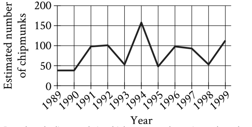
The line graph shows the estimated number of chipmunks in a state park on April 1 of each year from 1989 to 1999.
Based on the line graph, in which year was the estimated number of chipmunks in the state park the greatest?
1989
1994
1995
1998
1. TRANSLATE the question and graph information
The question asks: "In which year was the estimated number of chipmunks in the state park the greatest?"
- Given information from the graph:
- The vertical axis shows "Estimated number of chipmunks" (ranging from 0 to 200)
- The horizontal axis shows "Year" (from 1989 to 1999)
- The line connects data points for each year
- What we need to find:
- The year (x-coordinate) where the number of chipmunks (y-coordinate) is highest
2. INFER the strategy
- To find the "greatest number," we need to locate the highest point on the line graph
- The highest point means the peak with the greatest vertical height
- Once we find this peak, we read down to the horizontal axis to identify the corresponding year
3. TRANSLATE the graph visually
- Scanning the graph from left to right, look for the tallest peak
- The line shows several peaks and valleys
- The most prominent peak appears around the middle of the time period
- This peak reaches approximately 155 chipmunks (about 3/4 of the way between 100 and 200 on the vertical axis)
4. Identify the year at the maximum
- Reading straight down from the highest point to the horizontal axis
- This highest point corresponds to the year 1994
- Comparing with the answer choices given (1989, 1994, 1995, 1998), we confirm that 1994 is one of the options
Answer: B. 1994
Why Students Usually Falter on This Problem
Most Common Error Path:
Weak TRANSLATE skill: Students may misread the graph by confusing visually similar peaks or incorrectly reading the year labels on the horizontal axis.
For example, 1999 also shows an elevated value (approximately 115 chipmunks), and students might mistake this for the maximum if they're scanning quickly from right to left or if they don't carefully compare the heights of all peaks. The visual difference between approximately 115 and 155 might not seem dramatic at first glance.
This may lead them to select Choice D (1998) if they misread the 1999 peak as being at 1998.
Second Most Common Error:
Poor INFER reasoning: Students might not understand that "greatest number" means finding the absolute maximum across all years, and instead focus on a local peak or a year that shows significant change rather than the highest value overall.
For instance, a student might notice that 1995 shows a dramatic drop from 1994, or that 1989 is the starting point, and incorrectly focus on these years without systematically comparing all values.
This may lead them to select Choice C (1995) or Choice A (1989) based on misunderstanding what "greatest" means in this context.
The Bottom Line:
This problem tests whether students can accurately read visual information from a line graph and identify a maximum value. The key challenge is carefully comparing the heights of all peaks and correctly matching the highest point to its corresponding year label. Students must resist the temptation to rush or focus on dramatic changes rather than absolute values.
1989
1994
1995
1998