The scatterplot shows the relationship between two variables, x and y. A line of best fit is also shown. For...
GMAT Problem-Solving and Data Analysis : (PS_DA) Questions
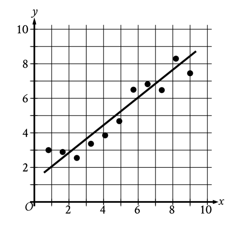
The scatterplot shows the relationship between two variables, x and y. A line of best fit is also shown. For how many of the 11 data points does the line of best fit predict a greater y-value than the actual y-value?
1. TRANSLATE the question
The question asks: "For how many data points does the line of best fit predict a greater y-value than the actual y-value?"
Let's break this down:
- Line predicts: The y-value on the line at a given x-coordinate
- Actual y-value: The y-coordinate of the data point itself
- Greater predicted than actual: The line's y-value \(\gt\) the point's y-value
2. INFER what this means visually
Here's the key insight:
- If the line predicts a greater y-value than the actual value, the data point must be below the line
- If the data point were above the line, then the actual value would be greater than the predicted value
So we need to count points that fall below the line of best fit.
3. VISUALIZE the points relative to the line
Now systematically scan the graph from left to right, checking each point:
Points below the line (predicted \(\gt\) actual):
- Near (1, 3): ✓ below
- Near (2, 3): ✓ below
- Near (3, 2.5): ✓ below
- Near (3, 3.3): ✓ below
- Near (4, 3.8): ✓ below
- Near (7, 6.7): ✓ below
Points on or above the line (predicted \(\leq\) actual):
- Near (5, 4.7): on the line
- Near (6, 6.5): above
- Near (7, 6.5): above
- Near (8, 8.3): above
- Near (9, 7.5): above
4. Count the results
Total points below the line: 6
Answer: 6
Why Students Usually Falter on This Problem
Most Common Error Path:
Weak INFER skill: Students confuse the relationship between position and prediction, counting points ABOVE the line instead of below it.
The phrase "predict a greater y-value than the actual" can be misinterpreted. Students might think: "greater means higher on the graph, so I should count points above the line." This reverses the correct logic—when the predicted value is greater than actual, the point sits below where the line predicts it should be.
This leads them to count 5 points (those above the line) instead of 6, resulting in an incorrect answer of 5.
Second Most Common Error:
Poor VISUALIZE execution: Students miscount the points, particularly in crowded regions of the graph.
In the middle section around x = 7, there are two points close together. Students rushing through might count this as one point, or they might misjudge whether borderline points (like the one near x = 5) are above, on, or below the line. These visual judgment errors lead to miscounts like 5 or 7 instead of the correct answer of 6.
The Bottom Line:
This problem tests whether you can translate verbal logic ("predicts greater than actual") into spatial reasoning ("point is below the line"). The key is understanding that when the line is higher than a point, the line over-predicts that point's value.