A student is researching monthly hours of sunshine in different cities in Alaska. When comparing trends in Anchorage and Fairbanks,...
GMAT Information and Ideas : (Ideas) Questions
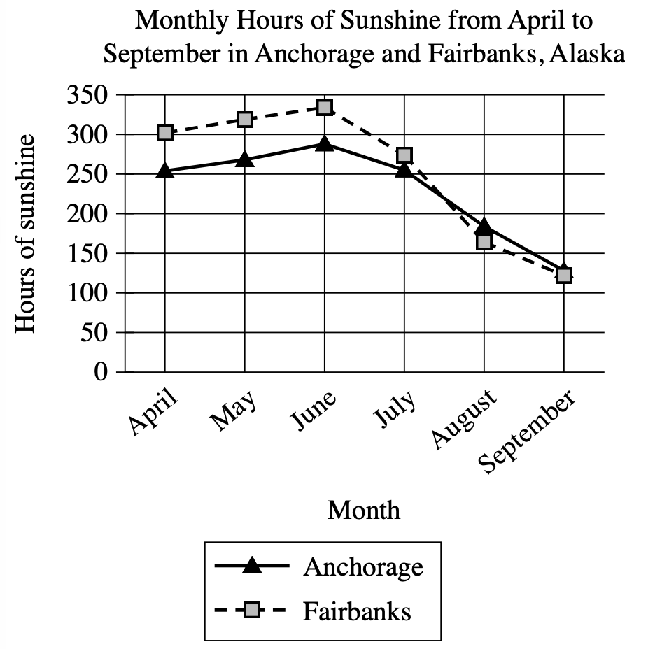
A student is researching monthly hours of sunshine in different cities in Alaska. When comparing trends in Anchorage and Fairbanks, the student concludes that the two cities show a similar pattern in the monthly hours of sunshine from April to September.
Which choice best describes data from the graph that support the student's conclusion?
The monthly hours of sunshine in both Anchorage and Fairbanks hold steady in June and July before beginning to decline in August.
The monthly hours of sunshine in both Anchorage and Fairbanks increase from April to June and then decrease from June to September.
Anchorage and Fairbanks both have less than 200 monthly hours of sunshine from April to September.
Anchorage and Fairbanks both have more than 300 monthly hours of sunshine from April to June and less than 200 hours from July to September.
Step 1: Decode and Map All Source Material
Visual Data Analysis:
- Visual Type & Title: Line graph - "Monthly Hours of Sunshine from April to September in Anchorage and Fairbanks, Alaska"
- What It Shows: (Note format)
- X-axis: Months (Apr → Sep)
- Y-axis: Hours sunshine (0-350 scale)
- Two cities: Anchorage (solid line, triangles) vs Fairbanks (dashed line, squares)
- 6-month period data
- Key Observations: (Note format)
- Both cities: ↑ Apr → Jun, then ↓ Jun → Sep
- Peak month: June for both (Anch ≈ 290, Fair ≈ 340)
- April: Anch ≈ 250, Fair ≈ 300
- July: Anch ≈ 250, Fair ≈ 280
- August: Anch ≈ 180, Fair ≈ 165
- September: Anch ≈ 130, Fair ≈ 120
- Similar trend shape despite different values
- Connection to Text: Graph provides the specific data that supports the student's conclusion about "similar patterns" between the two cities.
Passage Analysis Table:
| Text from Passage | Analysis |
|---|---|
| "A student is researching monthly hours of sunshine in different cities in Alaska." |
|
| "When comparing trends in Anchorage and Fairbanks, the student concludes that the two cities show a similar pattern in the monthly hours of sunshine from April to September." |
|
Passage Architecture & Core Elements:
- Visual Structure Map:
[RESEARCH CONTEXT] → [STUDENT'S CONCLUSION] - Similar patterns in sunshine hours - Main Point: A student concluded that Anchorage and Fairbanks show similar patterns in monthly sunshine hours from April to September.
- Argument Flow: The passage establishes research context then presents the student's comparative conclusion about seasonal sunshine patterns in two Alaskan cities.
- Text-Visual Synthesis: The text presents the student's conclusion while the graph provides the actual data that can either support or contradict this conclusion.
Step 2: Interpret the Question Precisely
What's being asked? Which choice best describes graph data that supports the student's conclusion
What type of answer do we need? Specific description of data/trends from the graph that demonstrate the claimed similarity
Any limiting keywords? "data from the graph" - must reference actual visual evidence; "support" - must show the conclusion is correct
Step 3: Prethink the Answer
- Both cities follow the same basic pattern: they increase from April to June (reaching their peak), then decrease steadily from June through September
- This creates nearly identical curve shapes, just at different heights
- The student's conclusion about "similar patterns" is supported by this shared trend structure
- The right answer should describe this common seasonal pattern that both cities follow - specifically the increase to June followed by the decline through September, since this demonstrates the claimed similarity
The monthly hours of sunshine in both Anchorage and Fairbanks hold steady in June and July before beginning to decline in August.
- Claims both cities "hold steady in June and July"
- Graph shows both cities actually decline from June to July (Fair: 340→280, Anch: 290→250)
- Misrepresents the actual data pattern
The monthly hours of sunshine in both Anchorage and Fairbanks increase from April to June and then decrease from June to September.
- Accurately describes the pattern: increase Apr→Jun, then decrease Jun→Sep
- Matches our graph observations exactly for both cities
- Demonstrates the "similar pattern" the student identified - same trend shape despite different values
- Provides specific data evidence supporting the student's conclusion
Anchorage and Fairbanks both have less than 200 monthly hours of sunshine from April to September.
- Claims both cities have "less than 200 hours from April to September"
- Graph shows both exceed 200 hours in April, May, June, and July
- Only August and September drop below 200 for both cities
- Factually inaccurate description of the data
Anchorage and Fairbanks both have more than 300 monthly hours of sunshine from April to June and less than 200 hours from July to September.
- Claims both cities have "more than 300 hours from April to June"
- Anchorage never reaches 300 hours (peaks at ≈290 in June)
- Only Fairbanks exceeds 300 in May and June
- Contains false information about the data