A team of scientists wants to improve the recycling of two of the most common types of lithium-ion batteries used...
GMAT Information and Ideas : (Ideas) Questions
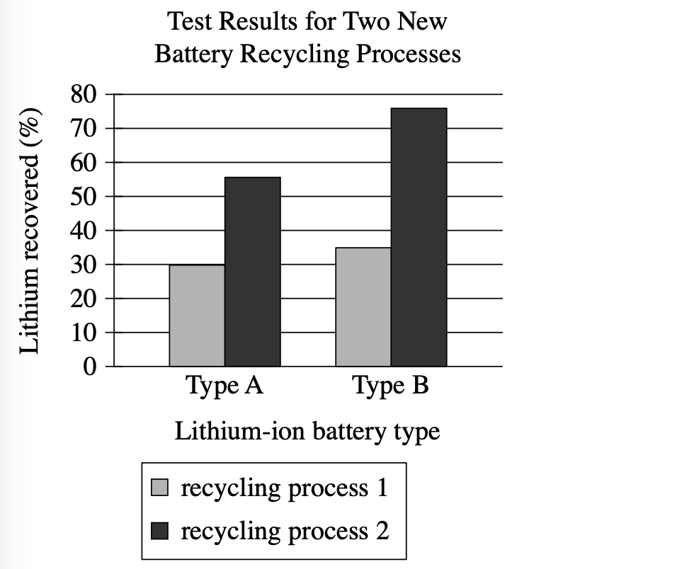
A team of scientists wants to improve the recycling of two of the most common types of lithium-ion batteries used in electronic devices. The team tested two new processes that involve grinding battery materials and aluminum foil together. The highest percentage of lithium recovered in the tests was closest to ________
Which choice most effectively uses data from the graph to complete the statement?
75%.
10%.
45%.
20%.
Step 1: Decode and Map All Source Material
Passage Analysis Table
| Text from Passage | Analysis |
|---|---|
| 'A team of scientists wants to improve the recycling of two of the most common types of lithium-ion batteries used in electronic devices.' |
|
| 'The team tested two new processes that involve grinding battery materials and aluminum foil together.' |
|
| 'The highest percentage of lithium recovered in the tests was closest to ______' |
|
Visual Data Analysis
Visual Type & Title: Bar chart - 'Test Results for Two New Battery Recycling Processes'
What It Shows:
- X-axis: Battery types (Type A, Type B)
- Y-axis: Lithium recovered (%)
- Two processes shown: Process 1 (light gray), Process 2 (dark gray)
- Scale: 0-80%
Key Observations:
- Type A: Process 1 ≈ 30%, Process 2 ≈ 55%
- Type B: Process 1 ≈ 35%, Process 2 ≈ 77%
- Process 2 > Process 1 for both battery types
- Type B > Type A for both processes
- Highest value: Type B + Process 2 ≈ 77%
Connection to Text: The graph provides the specific quantitative results from the 'tests' mentioned in the passage, showing recovery percentages for each combination of battery type and recycling process.
Passage Architecture & Core Elements
Main Point: Scientists tested two recycling processes on two battery types and achieved varying lithium recovery rates, with the question asking for the highest percentage recovered.
Argument Flow: The passage provides minimal context, focusing instead on directing attention to experimental results shown in the graph to answer a specific data extraction question.
Text-Visual Synthesis: The text provides context and method, while the graph contains all the quantitative results needed to answer the question.
Step 2: Interpret the Question Precisely
This is a fill-in-the-blank question asking us to choose the best logical connector. The answer must create the right relationship between what comes before and after the blank.
Step 3: Prethink the Answer
- Looking at the graph, I need to identify the tallest bar representing the highest lithium recovery percentage
- Scanning all four bars:
- Type A, Process 1: approximately 30%
- Type A, Process 2: approximately 55%
- Type B, Process 1: approximately 35%
- Type B, Process 2: approximately 77%
- The highest value is clearly Type B with recycling process 2, which reaches approximately 77% on the y-axis scale
- So the right answer should be the choice closest to 77%
75%.
✓ Correct
- This is closest to the actual highest value of approximately 77% shown for Type B with recycling process 2
- Matches our prethinking perfectly - the small difference (2%) accounts for normal reading variation from the graph
10%.
✗ Incorrect
- This percentage doesn't appear anywhere on the graph
- Far below even the lowest recovery rate shown (approximately 30% for Type A, process 1)
- Would represent a misreading of the scale or data
45%.
✗ Incorrect
- This would be between the values for Type A (process 2 ≈ 55%) and Type B (process 1 ≈ 35%)
- Not the highest value, which is clearly Type B with process 2 at ≈77%
- Trap: Students might average values or pick a mid-range number without carefully identifying the maximum
20%.
✗ Incorrect
- This percentage is below all values shown in the graph
- The lowest actual value is approximately 30%
- Represents a clear misreading of the graph data