Alessandro Nai et al. presented study participants with vignettes about fictive political candidates, portraying them as embodying a personality trait...
GMAT Information and Ideas : (Ideas) Questions
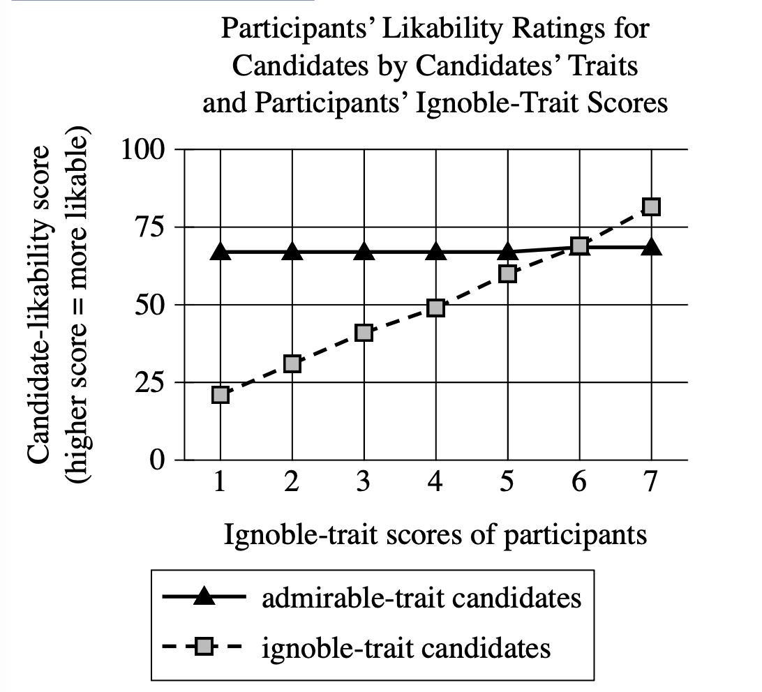
Alessandro Nai et al. presented study participants with vignettes about fictive political candidates, portraying them as embodying a personality trait widely considered admirable (e.g., agreeableness) or one considered ignoble (e.g., cynicism). A survey recorded participants' ratings of the candidates' likability and showed that across participants, ignoble-trait candidates were less likable than admirable-trait candidates. However, when the researchers factored in the participants' own personality-trait scores, on a scale of 1 (least ignoble) to 7 (most ignoble), they concluded that this relative ranking of candidates persisted except among the participants with high ignobility scores.
Which choice best describes data from the graph that support the researchers' conclusion?
There was a strong positive correlation between participants' ignobility scores and admirable-trait candidates' likability ratings, but there was no correlation between ignobility scores and ignoble-trait candidates' likability ratings.
Participants with an ignobility score of 5 or less rated admirable-trait candidates as more likable than ignoble-trait candidates, whereas participants with an ignobility score of 6 or more rated ignoble-trait candidates as equally likable as or even more likable than admirable-trait candidates.
Overall, participants rated admirable-trait candidates as quite likable, and that rating was not significantly affected by the participants' ignobility scores.
Unlike participants with an ignobility score of 6, participants with an ignobility score either greater or less than 6 gave admirable-trait candidates and ignoble-trait candidates different likability ratings.
Step 1: Decode and Map All Source Material
Part A: Passage Analysis Table
| Text from Passage | Analysis |
|---|---|
| "Alessandro Nai et al. presented study participants with vignettes about fictive political candidates, portraying them as embodying a personality trait widely considered admirable (e.g., agreeableness) or one considered ignoble (e.g., cynicism)." |
|
| "A survey recorded participants' ratings of the candidates' likability and showed that across participants, ignoble-trait candidates were less likable than admirable-trait candidates." |
|
| "However, when the researchers factored in the participants' own personality-trait scores, on a scale of 1 (least ignoble) to 7 (most ignoble), they concluded that this relative ranking of candidates persisted except among the participants with high ignobility scores." |
|
Visual Data Analysis
Visual Type & Title: Line graph titled "Participants' Likability Ratings for Candidates by Candidates' Traits and Participants' Ignoble-Trait Scores"
What It Shows: X-axis: Ignoble-trait scores of participants (1-7 scale), Y-axis: Candidate-likability score (0-100), Two lines: admirable-trait candidates (triangles, solid) vs ignoble-trait candidates (squares, dashed)
Key Observations: Admirable candidates: ~67-70 across all scores (relatively flat), Ignoble candidates: increase dramatically from ~20 (score 1) to ~80 (score 7), Low ignobility participants (1-5): big gap (admirable >> ignoble), High ignobility participants (6-7): gap closes/reverses, At score 7: ignoble (~80) > admirable (~68)
Connection to Text: Graph quantifies the "except among participants with high ignobility scores" claim - shows exactly where and how the preference reverses.
Part B: Passage Architecture & Core Elements
Main Point: A study found that while people generally prefer candidates with admirable traits over those with ignoble traits, participants who themselves scored high on ignobility showed the opposite preference pattern.
Argument Flow: The passage moves from describing a straightforward experimental setup to presenting an initial finding that seems intuitive, then reveals a more complex conclusion that this preference pattern actually depends on the participants' own personality traits.
Step 2: Interpret the Question Precisely
What's being asked? Which choice best describes data from the graph that support the researchers' conclusion
What type of answer do we need? A description of specific graph data that provides evidence for the main finding
Any limiting keywords? "from the graph" - we need to focus on visual data, and "support the researchers' conclusion" - must connect to the key finding about high-ignobility participants
Step 3: Prethink the Answer
- The researchers' conclusion was that the normal preference pattern (admirable > ignoble candidates) persists except among participants with high ignobility scores
- So the right answer should: Reference specific ignobility score ranges that show different patterns
- Show that low-ignobility participants prefer admirable candidates over ignoble ones
- Show that high-ignobility participants either equal out the preferences or actually prefer ignoble candidates
- Use actual data points from the graph to demonstrate this reversal
There was a strong positive correlation between participants' ignobility scores and admirable-trait candidates' likability ratings, but there was no correlation between ignobility scores and ignoble-trait candidates' likability ratings.
✗ Incorrect
- Claims strong positive correlation for admirable-trait candidates and no correlation for ignoble-trait candidates
- This is backwards - the graph shows admirable candidates stay relatively flat (no correlation) while ignoble candidates increase dramatically with participant ignobility (strong positive correlation)
Participants with an ignobility score of 5 or less rated admirable-trait candidates as more likable than ignoble-trait candidates, whereas participants with an ignobility score of 6 or more rated ignoble-trait candidates as equally likable as or even more likable than admirable-trait candidates.
✓ Correct
- Accurately describes the threshold effect: participants with ignobility \(\leq 5\) rate admirable \(\gt\) ignoble, while those with \(\geq 6\) rate them equally or ignoble higher
- Matches graph data precisely and directly supports the researchers' conclusion about high-ignobility participants showing different preference patterns
Overall, participants rated admirable-trait candidates as quite likable, and that rating was not significantly affected by the participants' ignobility scores.
✗ Incorrect
- Only describes the admirable candidate trend (staying relatively constant)
- Completely ignores the key finding about ignoble candidate ratings changing dramatically and misses the entire point about preference reversal
Unlike participants with an ignobility score of 6, participants with an ignobility score either greater or less than 6 gave admirable-trait candidates and ignoble-trait candidates different likability ratings.
✗ Incorrect
- Focuses too narrowly on score 6 as a specific dividing line and misses the broader pattern that the researchers identified
- The graph shows a gradual transition, not a sharp division uniquely at score 6