All other things being equal, the larger a wind turbine's rotor diameter (the diameter of the imaginary circle swept by...
GMAT Information and Ideas : (Ideas) Questions
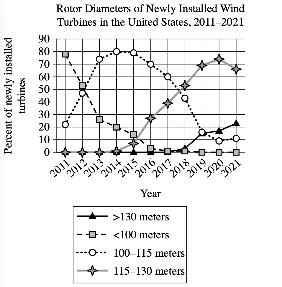
All other things being equal, the larger a wind turbine's rotor diameter (the diameter of the imaginary circle swept by the turbine's rotating blades), the greater amount of energy the turbine can generate. In a research paper on wind power, a student claims that in the United States, the amount of energy generated per newly installed turbine increased substantially between 2011 and 2021.
Which choice best describes data in the graph that support the student's claim?
The percentage of newly installed turbines with rotor diameters greater than 130 meters increased every year between 2011 and 2021.
In 2011, nearly 80% of turbines installed had rotor diameters of less than 100 meters, whereas only a little more than 20% of turbines installed that year had rotor diameters of 100–115 meters.
No turbines installed in 2011 had rotor diameters greater than 115 meters, whereas the majority of turbines installed in 2021 had rotor diameters greater than 130 meters.
Most turbines installed in 2011 had rotor diameters of less than 100 meters, whereas most turbines installed in 2021 had rotor diameters of at least 115 meters.
Step 1: Decode and Map All Source Material
Part A: Create Passage Analysis Table
| Text from Passage | Analysis |
|---|---|
| All other things being equal, the larger a wind turbine's rotor diameter (the diameter of the imaginary circle swept by the turbine's rotating blades), the greater amount of energy the turbine can generate. |
|
| In a research paper on wind power, a student claims that in the United States, the amount of energy generated per newly installed turbine increased substantially between 2011 and 2021. |
|
Visual Data Analysis
Visual Type & Title: Line graph - Rotor Diameters of Newly Installed Wind Turbines in the United States, 2011-2021
What It Shows:
- Y-axis: % of newly installed turbines
- X-axis: Years (2011-2021)
- 4 categories: <100m, 100-115m, 115-130m, >130m
- Tracks distribution of rotor sizes over time
Key Observations:
- 2011: ~80% <100m, ~20% 100-115m, 0% larger sizes
- 2021: ~0% <100m, ~10% 100-115m, ~65% 115-130m, ~22% >130m
- Clear shift: smaller to larger turbines over decade
- <100m category: decreased from 80% to near 0%
- 115-130m category: increased from 0% to dominant (~65%)
- >130m category: increased from 0% to significant (~22%)
Step 2: Interpret the Question Precisely
What's being asked? Which data in the graph supports the student's specific claim about increased energy generation per turbine.
What type of answer do we need? Evidence from the graph that demonstrates the substantial increase the student claims occurred.
Any limiting keywords? Yes - explicitly asks for data in the graph.
Step 3: Prethink the Answer
- The student claims energy per turbine increased substantially from 2011 to 2021
- Since the text tells us larger rotor diameter equals more energy, we need graph data showing turbines got significantly larger during this period
- The graph shows a dramatic shift: in 2011, about 80% of turbines were small (<100m) with none in the larger categories, while by 2021, about 87% were in the larger categories (115m+) with almost none remaining small
The percentage of newly installed turbines with rotor diameters greater than 130 meters increased every year between 2011 and 2021.
- Claims \(\gt\mathrm{130m}\) turbines increased every year
- Graph shows this is not true - the \(\gt\mathrm{130m}\) line dips between 2016-2017
- Also focuses only on the largest category, missing the broader shift
In 2011, nearly 80% of turbines installed had rotor diameters of less than 100 meters, whereas only a little more than 20% of turbines installed that year had rotor diameters of 100–115 meters.
- Only describes 2011 data without showing any change over time
- Does not demonstrate the substantial increase the student claims occurred
No turbines installed in 2011 had rotor diameters greater than 115 meters, whereas the majority of turbines installed in 2021 had rotor diameters greater than 130 meters.
- Correctly notes \(\mathrm{0\%}\) \(\gt\mathrm{115m}\) in 2011 but incorrectly claims majority \(\gt\mathrm{130m}\) in 2021 (graph shows \(\sim\mathrm{22\%}\), not \(\gt\mathrm{50\%}\))
- Contains factual error about the 2021 data
Most turbines installed in 2011 had rotor diameters of less than 100 meters, whereas most turbines installed in 2021 had rotor diameters of at least 115 meters.
- Accurately describes 2011: most \(\lt\mathrm{100m}\) (graph shows \(\sim\mathrm{80\%}\))
- Accurately describes 2021: most \(\geq\mathrm{115m}\) (\(\mathrm{115{-}130m}\) + \(\gt\mathrm{130m}\) = \(\sim\mathrm{65\%}\) + \(\sim\mathrm{22\%}\) = \(\sim\mathrm{87\%}\))
- Shows the substantial shift from small to large turbines that supports the energy increase claim