Argentina, Brazil, and the United States are among the world's leading producers of maize (corn), and each country exports a...
GMAT Information and Ideas : (Ideas) Questions
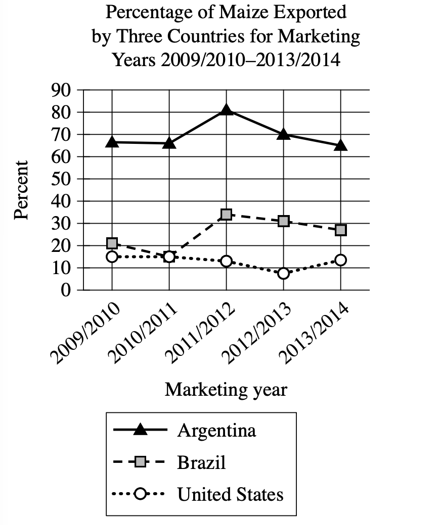
Argentina, Brazil, and the United States are among the world's leading producers of maize (corn), and each country exports a certain percentage of maize each marketing year, which runs from March to February in Argentina and Brazil and from September to August in the United States. A student is researching those percentages and finds that for the marketing year 2012/2013, the percentage of maize exported by _______
Which choice most effectively uses data from the graph to complete the text?
Brazil increased from the previous marketing year but remained lower than the percentage exported by the United States.
Brazil exceeded the percentage exported by Argentina for the first time.
Argentina decreased from the previous marketing year but remained the highest among the three countries.
the United States reached its highest point during the five marketing years.
Step 1: Decode and Map All Source Material
Text Analysis:
| Text from Passage | Analysis |
|---|---|
| Argentina, Brazil, and the United States are among the world's leading producers of maize (corn) |
|
| each country exports a certain percentage of maize each marketing year, which runs from March to February in Argentina and Brazil and from September to August in the United States |
|
| A student is researching those percentages and finds that for the marketing year 2012/2013, the percentage of maize exported by ______ |
|
Visual Data Analysis:
Visual Type & Title: Line graph - Percentage of Maize Exported by Three Countries for Marketing Years 2009/2010–2013/2014
What It Shows: (Note format)
- Variables: Marketing years (x-axis) vs Export percentages (y-axis, 0-90%)
- Countries: Argentina (△), Brazil (□), United States (○)
- Time span: 5 marketing years
- Data points for each country across all years
Key Observations: (Note format)
- Argentina: Highest overall (60-82%), peaked 2011/12 (~82%)
- Brazil: Middle range (18-35%), variable pattern
- US: Lowest overall (7-15%), dropped significantly 2012/13
- 2012/13 specific: ARG ~70%, BRA ~32%, US ~7%
Connection to Text:
The graph provides the specific percentage data referenced in the incomplete sentence about marketing year 2012/2013.
Step 2: Interpret the Question Precisely
This is a fill-in-the-blank question asking us to choose the best logical connector. The answer must create the right relationship between what comes before and after the blank.
Step 3: Prethink the Answer
- From the graph, I can see the 2012/2013 data points:
- Argentina: approximately 70%
- Brazil: approximately 32%
- United States: approximately 7%
- The correct answer should accurately describe what happened with one of these countries in 2012/2013, likely involving comparison to previous year or relative position among the three countries.
Brazil increased from the previous marketing year but remained lower than the percentage exported by the United States.
- Claims Brazil 'increased from the previous marketing year'
- Graph shows Brazil went from \(\mathrm{~35\%}\) (2011/2012) to \(\mathrm{~32\%}\) (2012/2013) - this is a decrease, not increase
- Also claims Brazil 'remained lower than the percentage exported by the United States'
- Graph shows Brazil (\(\mathrm{~32\%}\)) was much higher than US (\(\mathrm{~7\%}\)) in 2012/2013
Brazil exceeded the percentage exported by Argentina for the first time.
- Claims 'Brazil exceeded the percentage exported by Argentina for the first time'
- Graph clearly shows Argentina (\(\mathrm{~70\%}\)) was much higher than Brazil (\(\mathrm{~32\%}\)) in 2012/2013
- Brazil never exceeded Argentina in any year shown on the graph
Argentina decreased from the previous marketing year but remained the highest among the three countries.
- States 'Argentina decreased from the previous marketing year but remained the highest among the three countries'
- Graph confirms Argentina dropped from \(\mathrm{~82\%}\) (2011/2012) to \(\mathrm{~70\%}\) (2012/2013) - accurate decrease
- Argentina at \(\mathrm{~70\%}\) was indeed highest compared to Brazil (\(\mathrm{~32\%}\)) and US (\(\mathrm{~7\%}\)) in 2012/2013
- Both parts of the statement are verifiable from the graph data
the United States reached its highest point during the five marketing years.
- Claims 'the United States reached its highest point during the five marketing years'
- Graph shows US was at \(\mathrm{~7\%}\) in 2012/2013, which was actually its lowest point across all five years
- US highest points were \(\mathrm{~15\%}\) in 2009/2010 and 2010/2011