Economists Kerwin Kofi Charles and Melvin Stephens Jr. investigated a variety of factors that influence voter turnout in the United...
GMAT Information and Ideas : (Ideas) Questions
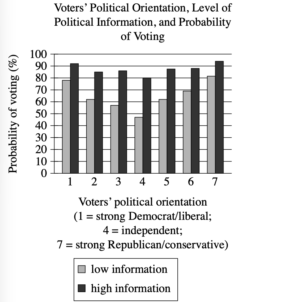
Economists Kerwin Kofi Charles and Melvin Stephens Jr. investigated a variety of factors that influence voter turnout in the United States. Using survey data that revealed whether respondents voted in national elections and how knowledgeable respondents are about politics, Charles and Stephens claim that the likelihood of voting is driven in part by potential voters' confidence in their assessments of candidates—essentially, the more informed voters are about politics, the more confident they are at evaluating whether candidates share their views, and thus the more likely they are to vote.
Which choice best describes data in the graph that support Charles and Stephens's claim?
At each point on the political orientation scale, high-information voters were more likely than low-information voters to vote.
Only low-information voters who identify as independents had a voting probability below 50%.
The closer that low-information voters are to the ends of the political orientation scale, the more likely they were to vote.
High-information voters were more likely to identify as strong Democrats or strong Republicans than low-information voters were.
Step 1: Decode and Map All Source Material
Passage Analysis Table
| Text from Passage | Analysis |
|---|---|
| "Economists Kerwin Kofi Charles and Melvin Stephens Jr. investigated a variety of factors that influence voter turnout in the United States." |
|
| "Using survey data that revealed whether respondents voted in national elections and how knowledgeable respondents are about politics," |
|
| "Charles and Stephens claim that the likelihood of voting is driven in part by potential voters' confidence in their assessments of candidates—" |
|
| "essentially, the more informed voters are about politics, the more confident they are at evaluating whether candidates share their views, and thus the more likely they are to vote." |
|
Visual Data Analysis
Visual Type & Title: Bar chart - "Voters' Political Orientation, Level of Political Information, and Probability of Voting"
What It Shows: X-axis shows political orientation (1=strong Dem/liberal, 4=independent, 7=strong Rep/conservative). Y-axis shows voting probability (%). Two bars per position: gray=low info, black=high info. Scale: 0-100%
Key Observations: High info > low info at ALL positions (1-7). Position 1: Low≈78%, High≈93%. Position 4: Low≈48%, High≈80%. Position 7: Low≈82%, High≈95%. Consistent pattern: High info voters always 15-32% higher
Connection to Text: Graph provides empirical evidence for C&S claim by showing voting probability across information levels and political orientations.
Passage Architecture & Core Elements
Main Point: Charles and Stephens claim that political information increases voting likelihood because informed voters feel more confident evaluating candidates.
Argument Flow: The passage establishes the researchers' methodology using survey data, then presents their claim that voting is driven by voter confidence, and finally explains the causal mechanism linking political information to confidence to voting behavior.
Text-Visual Synthesis: The text presents C&S theoretical claim about information driving voting likelihood, while the graph provides empirical evidence by showing voting probabilities across different information levels and political orientations, demonstrating the predicted relationship in real data.
Step 2: Interpret the Question Precisely
What's being asked? Which data from the graph supports Charles and Stephens's claim
What type of answer do we need? A description of graph data that provides evidence for their claim about information and voting likelihood
Any limiting keywords? "data in the graph" - must reference visual evidence; "support" - must align with their claim
Step 3: Prethink the Answer
- Charles and Stephens's claim is that more informed voters are more likely to vote because they're more confident in evaluating candidates
- The right answer should reference a pattern in the graph showing higher voting rates among high-information voters
- Should show this pattern consistently across the political spectrum
- Must directly connect to their claim about information level affecting voting likelihood
- Looking at the graph, at every single political orientation (positions 1-7), the high-information voters (black bars) have higher voting probabilities than low-information voters (gray bars)
- This pattern holds whether people are strong Democrats, independents, or strong Republicans
At each point on the political orientation scale, high-information voters were more likely than low-information voters to vote.
✓ Correct
- This directly describes the key pattern in the graph: at positions 1-7, high-information voters consistently show higher voting probabilities than low-information voters
- This perfectly supports C&S claim that informed voters are more likely to vote
- The consistency "at each point" demonstrates this isn't random but a systematic relationship
Only low-information voters who identify as independents had a voting probability below 50%.
✗ Incorrect
- This focuses on only one specific group (low-information independents) rather than the broader relationship between information and voting
- While it may be accurate about independents being below 50%, this doesn't support the claim about information driving voting likelihood across the board
The closer that low-information voters are to the ends of the political orientation scale, the more likely they were to vote.
✗ Incorrect
- This only examines low-information voters and their relationship to political orientation extremes
- It ignores the comparison between high and low-information voters, which is central to C&S claim
- Doesn't provide evidence that information level affects voting likelihood
High-information voters were more likely to identify as strong Democrats or strong Republicans than low-information voters were.
✗ Incorrect
- This misinterprets what the graph shows - it displays voting probabilities, not how many people identify with each political orientation
- The graph doesn't tell us about the distribution of high vs. low-information voters across the political spectrum
- Doesn't address the claim about information affecting voting likelihood