Researcher Judith Hilton and her team interviewed 55 people about which factors would make them switch from using single-use plastic...
GMAT Information and Ideas : (Ideas) Questions
Researcher Judith Hilton and her team interviewed 55 people about which factors would make them switch from using single-use plastic containers to reusable containers. The graph shows three of the factors mentioned in the interviews and the percentage of participants who mentioned them.
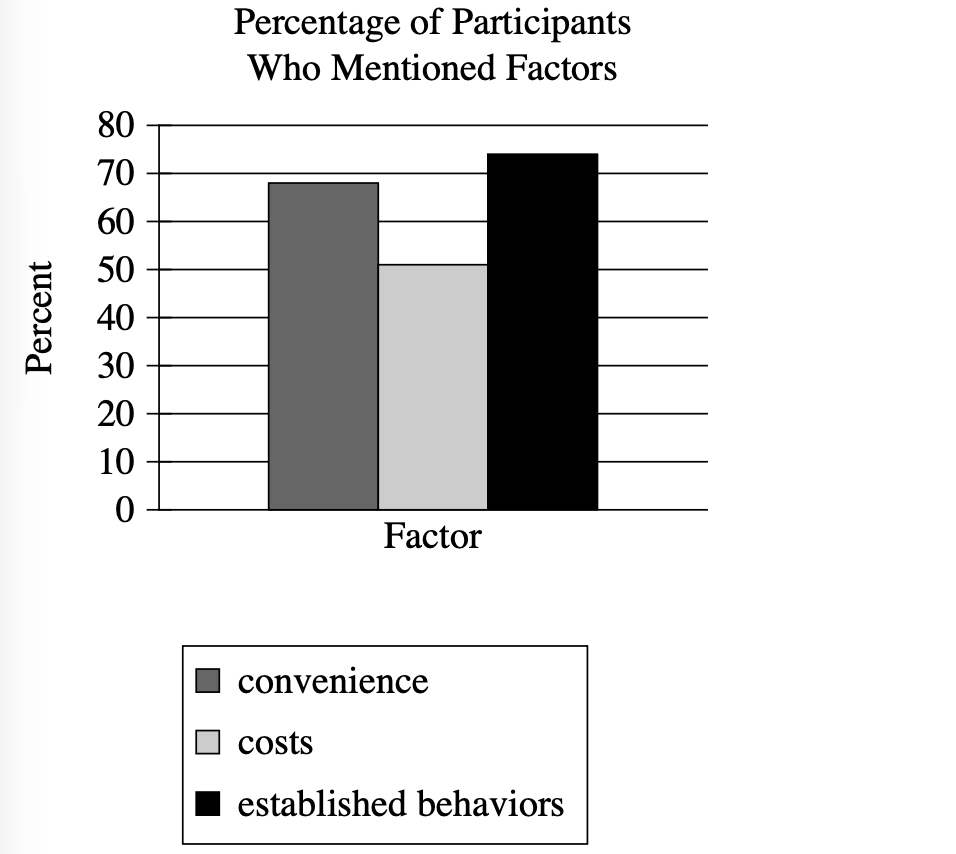
According to the graph, about what percentage of participants mentioned costs in the interviews?
10%
95%
25%
50%
Step 1: Decode and Map All Source Material
Passage Analysis Table
| Text from Passage | Analysis |
|---|---|
| "Researcher Judith Hilton and her team interviewed 55 people about which factors would make them switch from using single-use plastic containers to reusable containers." |
|
| "The graph shows three of the factors mentioned in the interviews and the percentage of participants who mentioned them." |
|
Visual Data Analysis
Visual Type & Title: Bar chart titled "Percentage of Participants Who Mentioned Factors"
What It Shows: (Note format)
- Y-axis: Percentages from 0-80%
- X-axis: "Factor" (single category with 3 bars)
- 3 factors measured: convenience, costs, established behaviors
- Data from interviews with 55 people
- Shows % who mentioned each factor
Key Observations: (Note format)
- Established behaviors (black): ~75% (highest)
- Convenience (dark gray): ~69%
- Costs (light gray): ~50% (lowest)
- All factors mentioned by significant % of participants
- Established behaviors > convenience > costs
Connection to Text:
The graph provides specific quantitative data for the interview findings mentioned in the text, showing exactly what percentage of the 55 participants mentioned each factor.
Passage Architecture & Core Elements
Visual Structure Map:
[RESEARCH CONTEXT] Study setup: Hilton team + 55 interviews Focus: factors for container switching [VISUAL DATA] Graph: 3 factors + percentages who mentioned each
Main Point: A research study interviewed people about factors that would make them switch to reusable containers, with results displayed in a graph.
Argument Flow: The text establishes the research context and explains that the graph provides specific quantitative results from those interviews.
Text-Visual Synthesis: The text provides the research framework while the graph delivers the specific numerical findings, showing that established behaviors was mentioned most frequently (~75%), followed by convenience (~69%), then costs (~50%).
Step 2: Interpret the Question Precisely
What's being asked? The specific percentage of participants who mentioned "costs" according to the graph
What type of answer do we need? A numerical percentage that can be read directly from the visual data
Any limiting keywords? "According to the graph" - we must use only the visual data, and "about what percentage" - allows for approximation
Step 3: Prethink the Answer
- From our graph analysis, we can see that costs is represented by the light gray bar
- Looking at where this bar reaches on the y-axis, it appears to hit right at the 50% mark
- The question asks for "about what percentage," so we need an answer that matches this visual reading
- The right answer should be approximately 50%, since that's where the costs bar reaches on the percentage scale
10%
- Claims only 10% mentioned costs
- The graph clearly shows the costs bar reaching much higher than 10% - it reaches the 50% line
- This significantly underestimates what the visual data shows
95%
- Claims 95% mentioned costs
- This would make costs the highest factor, but the graph shows costs as the lowest of the three factors
- The costs bar is clearly the shortest, not reaching anywhere near the top of the scale
25%
- Claims 25% mentioned costs
- The costs bar extends well above the 25% mark on the y-axis
- What trap this represents: Students might misread the scale or confuse the heights of different bars
50%
- States 50% mentioned costs
- The light gray bar (costs) reaches exactly to the 50% line on the y-axis
- This matches our visual reading of the graph data perfectly